How stores promote a brand identity and create memorable experiences
The shift to e-commerce in recent years has encouraged retailers to rethink how they present products and interact with customers in brick-and-mortar stores.
LFRA members recently went on an Overseas Study Tour across San Francisco, San Jose, and Los Angeles where they were provided an “all-access pass” to senior management who shared their knowledge and hosted private tours.
Elevating the store experience by hosting activities demonstrating the brand’s expertise and the innovative use of space to promote a brand identity were common themes throughout the eight-day tour.
Learning from RH San Francisco flagship store design and architecture
One of the most memorable experiences on the Overseas Study Tour was the visit to the new RH (formerly known as Restoration Hardware) flagship store in San Francisco.
RH is an upscale American home furnishings company that rebranded from Restoration Hardware in 2012 to better reflect their identity and direction beyond their hardware store beginnings.
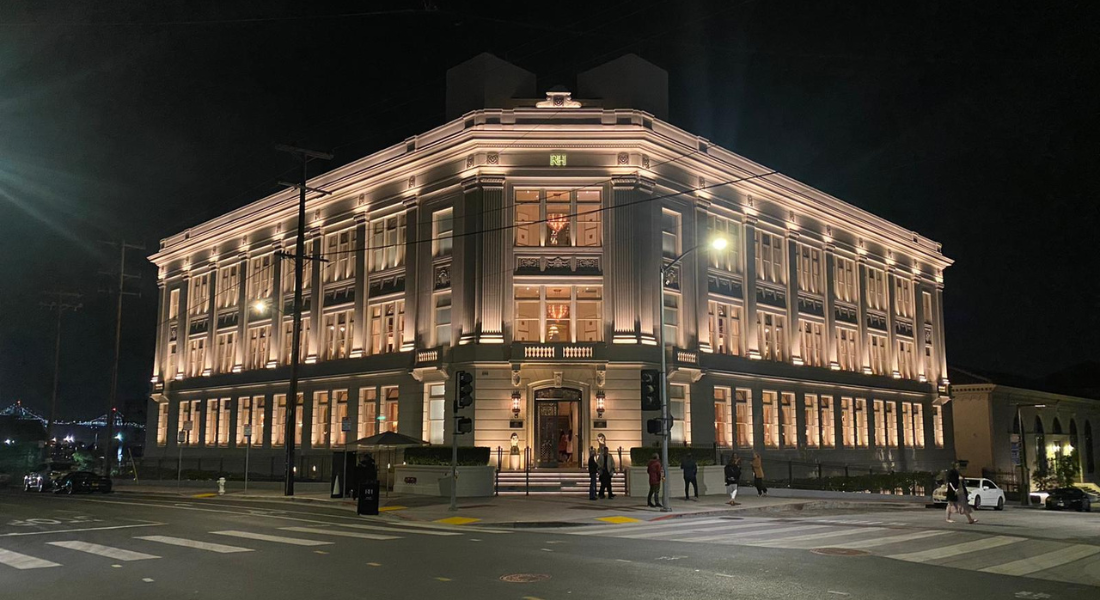
RH San Francisco opened in May 2022 and was the first retail stop on the tour.
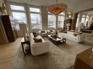
Much thought and investment has poured into the RH San Francisco flagship store, which is a 7,500 sqm physical representation of the RH brand identity.
This iconic five-storey building was designed by San Francisco architect Frederick H. Meyer and was once the office of Bethlehem Steel, the manufacturers of the steel sections and parts for the Golden Gate Bridge.
The neoclassical building’s rejuvenated interior and exterior is guaranteed to leave a lasting impression on everyone that walks by or through the store’s hand-forged iron doors.
Notably, RH do not call their stores “stores” or “showrooms”, but rather “galleries”.
RH deliberately use the term “galleries” to elevate and shape the customer’s perception of the RH brand as one of quality, elegance, and luxury.
Galleries also best describes how customers should experience the brand and its products, where customers are encouraged to leisurely stroll through the Bethlehem Building like an art gallery and admire the products that are on display.
An example of the attention to detail includes the use of five different shades of off-white paint on the building’s exterior so that the building is the one colour no matter what angle the sun is shining on the building during the day.
Customers walk on restored oak flooring which is of original design in the L-shaped building.
The original staircase was revived by the RH team who are passionate about drafting and creating beautiful spaces.
The outdoor collection is on display on the building’s rooftop, where people can sip on wine from the RH dining room and enjoy the view of San Francisco whilst sitting on RH chairs.
Building the brand beyond the products
Brick-and-mortar stores are innovating into spaces that house more than just products.
They have become destinations of expertise, experience, and activities.
A brand’s identity is one of the key points of difference and personalises a brand. This personalisation can help build an emotional connection with customers.
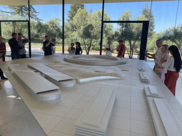
Apple’s brand as creative, modern, innovative was on full display at the Apple Park Visitor Centre in Silicon Valley.
Firstly, the location of the iconic Apple Park Visitor Centre itself positions Apple as a leading brand in technology and innovation.
The Apple Park Visitor Centre is more than a place where people can explore and learn about Apple products.
One of the store’s unique offerings is an interactive augmented reality experience that Apple has built to show guests inside the $5 billion Apple Headquarters nearby.
Visitors point an Apple iPad installed with a special app at the scale model to explore the spaceship-shaped building.
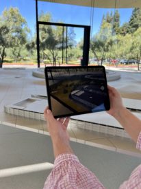
The AR experience is highly interactive where people can see and zoom into details such as foliage, lighting, and building details.
Users can also change the time of the day on the app to appreciate the building’s design from sunrise to sunset.
The AR experience is another element of the store that further positions and validates Apple as a leading brand in technology and innovation, with approximately a third of Visitor Centre is dedicated to an aluminium scale model of Apple Park.
Consistency across store design and architecture bolsters a brand identity
The Overseas Study Tour demonstrated that there is a need to adopt design solutions that are appropriate for the store’s location, function, and their customers.
Brand identity can be achieved with consistency across store architecture and design.
LFRA members were fortunate to have visited two RH galleries in San Francisco, RH San Francisco and RH Marin.
RH Marin is a 5,500 sqm design gallery that blurs the lines between residential and retail, indoors and outdoors, home and hospitality.
RH Marin opened in July 2020 and is seen as a prototype gallery for the retailer because it is a recent expression of RH’s own new build and design.
The private tours at RH San Francisco and RH Marin provided members with the opportunity to learn more about the RH brand identity and compare the two galleries.
RH have a design ethos inspired by Leonardo da Vinci’s The Vitruvian Man, namely:
- We believe the most pleasing environments are a reflection of human design a study of balance, symmetry and perfect proportions
- We respect the hierarchy and important relationships between architecture, furniture and décor that creates harmony
- It is a discipline of addition through subtraction, where less becomes more, and calm is created throughout continuity
- We subscribe to the principles of Vitruvius where perfect proportions exist in human design, and beauty is produced by the pleasing appearance and good taste of the whole
These design principles were displayed on the walls of RH San Francisco.
Similarities observed include the symmetrical layout, seamless integration of retail and hospitality with a bar and restaurant and the carefully curated home concepts and spaces on display.
The main difference between the two galleries was the colour theme used throughout each building.
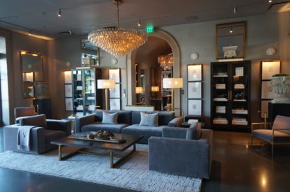
With RH Marin the colour palette of gallery was a darker neutral with elements of grey and black, whereas the colour palette of the RH San Francisco gallery was a lighter neutral with lots of warm beige and timber tones.
Although it is important to have consistency across store architecture and design, it is equally as important for stores to be unique retail destinations with their own character.
This article is a part of a 10-segment series covering the 2022 LFRA Overseas Study Tour.